Druids Cider

After 15 years of the same design, it was decided that Druids Cider needed a complete redesign. This was needed to move Druids away from the perception that it was a "Bulmers clone" and to give it a more defined, modern and unique visual identity.

Original can design

Original packaging
To create a completely new look for Druids I proposed a move away entirely from traditional cider imagery like apple presses and orchards and focus on the name. I commissioned the illustrator Mick Minogue to develop artwork that I worked with to create an original character that would represent the brand. We drew on on sources as diverse as Irish mythology, Assassin’s Creed and rave culture to create a Druid that was both mystical and modern.
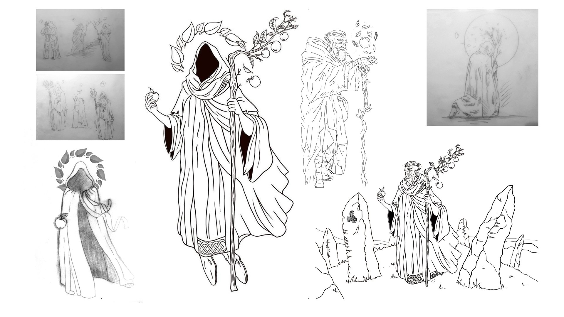
Character exploration and development
The logo was redesigned to compliment the new Druid. Moret was chosen for typography because it struck the right balance of classic and contemporary, Moret's design was inspired by twentieth-century European sign painting. The wordmark is framed by Ogham, the medieval Irish alphabet, and translates to "Druids Cider"

The physical finishing of the packaging was also improved. To enhance on shelf visibility heavy stock card and vivid full colour printing were chosen to replace shrink wrapping. The can is printed in a vibrant gold and a rich black. A matte finish was chosen to give the can a more premium look and feel.

Redesigned can

Redesigned packaging
While cider sales are declining nationwide, Druids has bucked the trend and increased its sales moving up to become Ireland's best-selling cider in the off-licence trade in 2023.